Ever since the inception of advertising and sign making in the early 20th century, branding has always had a strong presence in a businesses arsenal to attract and retain customers. This has seen exponential growth in recent years, with a popular and effective method being vehicle branding. We want to help break down the reasoning behind this form of advertising, and how to maximise the return on your vehicle design.
All branding can be seen as an executive summary of what a business is about. An elevator pitch letting your customers know who you are, what you do, and where to find you. It can also communicate the ethos or style of your brand, and allow customers to develop an affinity or connection with that.
Take Tesla as an example, their cars are electric and more expensive than their competitors. So their website focuses more on quality and style, leaving out price figures. Add to this a few quirky features to their product such as ‘Ludicrous Mode’ that adds a sense of excitement to their brand, and you have tapped in to a powerful niche market.
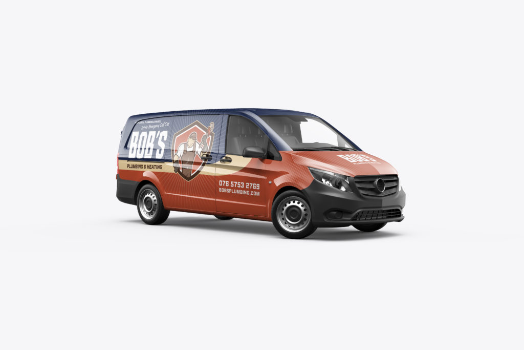
This type of thinking can be applied to vehicle wrap branding. Making sure that there is a strong focus on design style, color, font, imaging and most importantly messaging, vehicle wraps can be a powerful way to reach a wide audience.
The core benefits of this form of branding are that it has a wide reach, it is highly cost effective (according to the Outdoor Advertising Association of America, vehicle advertising can be the most effective and efficient form of out of home advertising, reaching more consumers at a lower cost per thousand impressions than any other form of advertising), noticeable, appears professional, and works 24/7 to ensure your brand has exposure. Furthermore, according to Perception Research, mobile advertising generates 2.5 times more attention than static.
When focusing on branding, color will play a large role. Being aware of your industry and sector can play into your colour scheme choice massively. For example, it has been suggested that the color red can bring about subtle changes to hunger and appetite. When we think of red in the branding world, we think of McDonalds, Burger King, KFC and TGI Friday’s to name a few. Blue can be associated with health and wellbeing (Bupa, NHS, Crest Toothpaste), and Black and White can be associated with style and elegance (Prada, Gucci, Versace).
Vehicle wrap branding is one of the most effective, efficient and accessible forms of advertising today. Any small business with the potential to do so should take a look at vehicle branding options available to them. Before starting, however, it is important to ensure that you have the correct vehicle template to suit your vehicle before starting design work. Use Signelements Vehicle Template Finder tool to find the exact vehicle for your requirements.




No Comments