
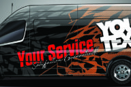
At Signelements, we know the word ‘pop’ can bring back some stressful memories for designers (sorry). But, on the upside, we’re here to give a few helpful tips on how you can edge a little closer to having designs that ‘pop’. Particularly when it comes to logos or sign design specifically. So next time you have a client asking you to just make it ‘pop’ more, hopefully our guide can give you a few ideas on what to add.
- Contrast
Ok, we know this is graphic design 101, but a lot of the time taking a moment to reconsider whether you have given your design enough contrast, as this is often what people mean when they say ‘pop’. Making a key part of your designs stand out (such a logo or tagline) can really bring attention to the more important parts of the message.
- Consider 3D
Depending on the design style, it might be worth considering giving your logo a 3D look. This wont work for all design style (for example, flat minimalist) but if it fits in, and adds a complimentary extra feature to your design, give it a try.
- Less is More
Try not to use too much text. It can make your design crowded and less appealing to read for prospective customers. To get around this, keep text as limited as possible to bring attention to the key parts of the sign.
- Dial up the Intensity
When it comes to color, feel free to whack it up a notch in terms of intensity. Having strong, powerful colors can really contribute to having your signage stand out, and as a result catch the customers eye. Bold, loud colors can really lend themselves to the ‘pop’ effect.
- Try Out a Different Font
It may seem simple, but using a different font can liven up a sign design. Experiment with different styles or typefaces that you think could compliment your branding efforts.
Hopefully these concepts have given you a few ideas of your own to try. However, having top quality graphics is crucial to creating a successful sign design. Let us help you out a little more: whether you’re looking for logos, vector backgrounds, fonts or high-resolution photography, we’ve got you covered with the Signelements ‘Pop’ Lightbox.


No Comments