At Ingimage we like to lift the mood where we can and add a colorful flair to our collections – this makes Spring one of our favorite seasons! As usual we’re going to showcase some of our favorite content, bringing you the best images to use in your branding efforts this season. Given that Spring is a time where flowers are blooming, the days are getting longer and more color starts to seep into our days, we wanted to focus on putting together some amazing color palettes to really bring out the brighter aspects of the world around us. Allow us to introduce our top 3 color palettes for Spring.
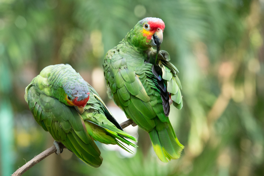
Parakeet Green

A vibrant, powerful green that conveys all things natural and gives a sense of the serene. Anyone looking to start a summer branding campaign surrounding the great outdoors or natural retreats should be taking a look at Parakeet Green. Complemented by colors such as light pinks or blues can help to set a very lighthearted, sunny and summery atmosphere for your designs.
Baby Blue

Baby Blue can represent calm, hope, peace and optimism. Think of a clear blue sky on a warmer Spring day, a calm tranquil lake or the obvious newborn baby boy. The aim with all of our Spring color palettes is to bring a sense of positivity, light and happiness. So, let a ray of sunshine into your designs by employing the Baby Blue color palette for your designs this Spring.
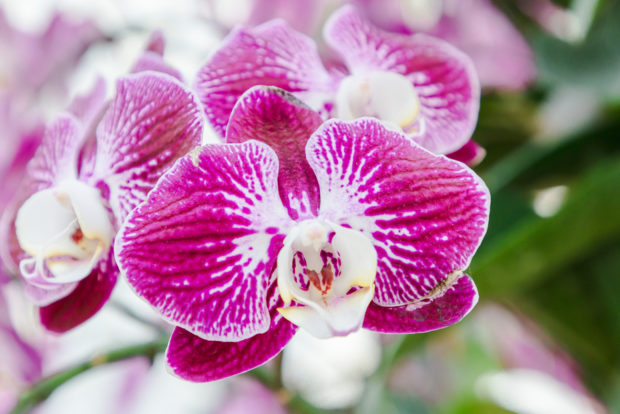
Bubblegum Pink

Another pastel focused color of warmth symbolizing friendship, affection and harmony. A color commonly associated with love (both of yourself and others), pink is the color to use for any sense of intimacy or inner peace. We have chosen Bubblegum Pink specifically because it offers a brighter shade of pink, a more upbeat atmosphere and a sense of intimacy. Remember, pink is the sweet side of red.
Spring officially starts on Friday 20th March 2020 in the northern hemisphere. Get your branding up to speed and get ahead of the game with the Ingimage Spring Color Palette lightbox: https://www.ingimage.com/search/smsx_lb_123084.html


No Comments